Introduction
The COVID-19 global health crisis brought both great strain and difficulty to nations across the world as governments and leaders grappled with the pandemic and its effects. Originating in Wuhan, China around November/December of 2019, COVID-19 spread to every country since the first cases were reported in the region. The virus was first confirmed in February 2020 here in the United States, and since then, has spread throughout all parts of the country. As of December 2020, when this analysis and report were initially conducted, according to the World Health Organization (WHO) there have been more than 4,300,000 coronavirus cases worldwide, and more than 290,000 deaths as the graph shows below. With the introduction of effective vaccines and the development of “herd immunity” throughout the general population, the COVID-19 health emergency has been officially declared over as of May 2023, three years after the initial surge of cases and deaths here in the United States. Data and conclusions presented in this projects represent the situation as of December 2020 using data from the City of Chicago Public Data Portal.
This report will set out to determine whether or not there are variations in observed COVID-19 cases, deaths, and testing, specifically within the city of Chicago context. This will be done by measuring socio-economic variables such as income, demographic breakdown, and age throughout the 58 zip codes in the city. Of course, while this report is unable to draw any explicit conclusions from observed correlations and association, highlighting spatial data through the use of maps should be a good starting point in beginning to explain any discrepancies. Specific data analysis will include multiple spatial analysis techniques, including Moran plots, LISA maps, and multi-variable linear regressions. Following this will be a general essay on the future of cities as a whole following COVID-19.
Exploratory Spatial Data Analysis (ESDA) of COVID Case and Death Rates in Chicago
General Statistics on the COVID-19 Health Situation in the City Visualized
This section will focus on mapping COVID-19 cases and deaths throughout the city and break them down by zip codes. The goal of this spatial analysis is to highlight any discrepancies or outstanding areas that are COVID “hot spots” or “cold spots” in order to get a better sense of the distribution of COVID around the city. This will be done through mapping total positive cases and deaths as well as the positivity and death rates for each zip code throughout the city.
1. Getting the Data Loaded and Prepped for Analysis
 # Loading the necessary packages and data
      {r, echo=F, message=F,fig.height = 4, fig.width = 5}
      library(ggplot2)
      library(ggthemes)
      library(plotly)
      data<-readRDS("weekly.RDS")
      data$WeekEnd<-as.Date(data$WeekEnd)
      p1<-ggplot(data =data, aes(x = WeekEnd, y = deaths))+
       theme_economist_white(base_size = 14, gray_bg = FALSE) + scale_colour_economist() +
       geom_line(size = 1.4) +
       labs(x = "Date", y="Total number of deaths")+
       scale_x_date(date_labels = "%m/%d", date_breaks="4 weeks")

      ggplotly(p1)
2. Constructing the Maps
 #creating the shapefile:
 libs<-c("tidyverse","GISTools","rgdal","spdep", "sp","ggplot2","ggthemes", "viridis", "tidyverse", "ggmap", "tmap")
 lapply(libs, require, character.only = TRUE)
 chicago_map<-readOGR("covid19_chitown.shp", layer ="covid19_chitown")


 #linking COVID case data to the shapefile maps:
 tmap_mode("view")
 tm_shape(chicago_map)+
 tm_polygons("Totalcase",
          breaks=c(0,2000,4000,6000,8000,10000,12000),
          alpha=0.7,
          palette = "OrRd",
          title="COVID-19 Total Observed Cases",
          popup.vars=c("Zip Code"="GEOID", "Total Observed COVID Cases"="Totalcase", "Total Population"="TotalPop" ))+
 tm_basemap(server="OpenStreetMap",alpha=0.5)
Below is an interactive map of the total observed positive cases per zip code in the city of Chicago. While this map on its own is unable to say much on its own as it does not take into account the amount of people tested, it provides a good starting point to look at the city. Notably, it appears that all zip codes in heavily residential areas have anywhere from 2,000-12,000 COVID cases based on test results, with the west side of the city seeming to particularly hard hit with a significant amount of COVID cases, anywhere from 8,000-12,000. This map, along with the following maps in this initial section, will be referred to later once linear regression analysis and mapping of other socio-economic variables such as income or population density are taken into account.
The following maps are similar to the map made above in the sense that they do not hold a lot of explanatory power on their own and instead aim to visualize the general health situation in Chicago given on a map.
 #Total Deaths:
 tmap_mode("view")
 tm_shape(chicago_map)+
 tm_polygons("Totaldeath",
          breaks=c(0,40,80,120,160,200),
          alpha=0.7,
          palette = "OrRd",
          title="COVID-19 Total Deaths",
          popup.vars=c("Zip Code"="GEOID", "Total COVID Deaths"="Totaldeath", "Total Population"="TotalPop" ))+
 tm_basemap(server="OpenStreetMap",alpha=0.5)

 #Case Rate:
 tmap_mode("view")
 tm_shape(chicago_map)+
 tm_polygons("Caserate",
          breaks=c(0,2000,4000,6000,8000,10000),
          alpha=0.7,
          palette = "OrRd",
          title="COVID-19 Observed Positive Cases Per 100,000 people",
          popup.vars=c("Zip Code"="GEOID", "Total Observed Positive Cases per 100,000"="Caserate", "Total Population"="TotalPop" ))+
 tm_basemap(server="OpenStreetMap",alpha=0.5)

 #Death Rate:
 tmap_mode("view")
 tm_shape(chicago_map)+
 tm_polygons("Deathrate",
          breaks=c(0,50,100,150,200,250,300),
          alpha=0.7,
          palette = "OrRd",
          title="COVID-19 Death Rate Per 100,000 People",
          popup.vars=c("Zip Code"="GEOID", "Death Rate per 100,000"="Deathrate", "Total Population"="TotalPop" ))+
 tm_basemap(server="OpenStreetMap",alpha=0.5)

 #Total Tests:
 tmap_mode("view")
 tm_shape(chicago_map)+
 tm_polygons("Totaltest",
          breaks=c(0,15000,30000,45000,60000,75000,90000),
          alpha=0.7,
          palette = "OrRd",
          title="COVID-19 Total Tests Conducted",
          popup.vars=c("Zip Code"="GEOID", "Total COVID Tests Conducted"="Totalcase", "Total Population"="TotalPop" ))+
 tm_basemap(server="OpenStreetMap",alpha=0.5)
If the maps above were to be taken at face value, then it would appear that neighborhoods in the south and west sides of the city have higher observed cases and deaths from COVID-19. However, these exploratory maps disregard any impact that other variables may have on the zip codes in question. Because of such, it would also be helpful to map some pertinent variables that may help explain the observed cases and deaths in the dataset. But as mentioned before, the graphs above serve as a good starting point for further analysis into COVID-19 trends in Chicago. As noted, the south and west sides seem to be hit the hardest in terms of cases and deaths while at the same time seemingly having less testing compared to the north side areas.
Pertinent Socio-economic and Land-Use Characteristics Visualized
While the maps above do not say much on their own, data from the 2018 5-year ACS can help put together a sample of pertinent explanatory variables in the form of map. While not an exhaustive list of variables, this analysis will focus specifically on:
- Share of people 60 or older;
- Share of people living below the poverty line;
- Share of people with health insurance;
- Share of houses with 4 or more people;
- Population density
These independent variables should help provide a sense of the economic conditions and access to health care that these areas face. Those below the poverty line, for example, most likely work low-paying service jobs that may expose said group to more people, resulting in an increase risk for contracting COVID. Similarly, those without health insurance are much less likely to visit a hospital and seek care when necessary out of fear for being unable to pay for treatment.
 #Share of people 60 or older:
 tmap_mode("view")
 tm_shape(chicago_map)+
 tm_polygons("above60",
          breaks=c(0,0.05,0.10,0.15,0.20,0.25,0.3),
          alpha=0.7,
          palette = "OrRd",
          title="Share of Population of People above 60",
          popup.vars=c("Zip Code"="GEOID", "Share above 60"="above60", "Total Population"="TotalPop" ))+
 tm_basemap(server="OpenStreetMap",alpha=0.5)

 #poverty rates:
 tmap_mode("view")
 tm_shape(chicago_map)+
 tm_polygons("belowpov",
          breaks=c(0,0.10,0.20,0.30,0.40,0.50),
          alpha=0.7,
          palette = "OrRd",
          title="Share of Population Living Below Poverty Line",
          popup.vars=c("Zip Code"="GEOID", "Share below Poverty Line"="belowpov", "Total Population"="TotalPop" ))+
 tm_basemap(server="OpenStreetMap",alpha=0.5)

 #Share of people with health insurance:
 tmap_mode("view")
 tm_shape(chicago_map)+
 tm_polygons("HIcov",
          breaks=c(0.7,0.75,0.80,0.85,0.90,0.95,1.0),
          alpha=0.7,
          palette = "OrRd",
          title="Share of Population with Health Insurance",
          popup.vars=c("Zip Code"="GEOID", "Share with Health Insurance"="HIcov", "Total Population"="TotalPop" ))+
 tm_basemap(server="OpenStreetMap",alpha=0.5)

 #Share of house with 4+ people:
 tmap_mode("view")
 tm_shape(chicago_map)+
 tm_polygons("crowdedHH",
          breaks=c(0,0.08,0.16,0.24,0.32,0.40,0.48),
          alpha=0.7,
          palette = "OrRd",
          title="Share of Households with 4+ People",
          popup.vars=c("Zip Code"="GEOID", "HH with 4+ People"="crowdedHH", "Total Population"="TotalPop" ))+
 tm_basemap(server="OpenStreetMap",alpha=0.5)

 #Population Density:
 tmap_mode("view")
 tm_shape(chicago_map)+
 tm_polygons("popdens",
          breaks=c(0,3000,6000,9000,12000,15000,18000),
          alpha=0.7,
          palette = "OrRd",
          title="Population Density (People/Square Mile)",
          popup.vars=c("Zip Code"="GEOID", "Population Density"="popdens", "Total Population"="TotalPop" ))+
 tm_basemap(server="OpenStreetMap",alpha=0.5)
There are a few interesting takeaways that can be noted from the maps above.
- Age: It appears that the areas with the highest amount of people above 60 relative to other zip codes in Chicago tend to be located on the extremities of the city towards the northwest and southwest parts. However, it also seems that the south side has higher proportions of elderly population relative to the north side areas.
- Poverty levels: Poverty wise, the south and west sides have noticeably higher amounts of families living below the poverty line compared to the city. This is not surprising given the chronic issues that these areas face in terms of poverty, crime, and disinvestment.
- Health Insurance/Houshold Size: The map of health insurance coverage reveals that most areas are covered, but there is a much lower proportion of people (70-80%) covered by health insurance in the west side compared to the other areas (90%+). The west side also shows the highest relative proportion of households with 4+ people, indicating higher changes for more people coming and going from these houses. These houses have a higher risk of COVID positivity given the larger amount of people living in the same space.
- Population Density: The last map for population density is consistent with the general arrangement of the city, with higher densities in the north of downtown and northern neighborhoods of Chicago that sport more condominiums than the south side. This is not surprising as areas closer to the downtown area will be more dense in agreement with the concentric city model and has to do with the relative price of capital and land.
Overall, these observations are consistent with preconceived notions about the various parts of the city, specifically the north vs. south and west side differences.
Constructing the Moran I statistic
In order to better determine spatial autocorrelation amongst the COVID-related variables, this report will utilise a Moran I statistic test in order to create a scatterplot that designates the intensity of COVID cases and deaths of zip codes and their neighbors. This will be done through three steps:
- Construction of a spatial weighted matrix
- Visualization of results of Moran's I test on a scatterplot
- Construction of a LISA map to visualize "hot" and "cold" COVID spots
Determining the Spatial Wieght Matrix and Running Morans I Test
The W matrix that will be used for the purposes of this analysis is the queen matrix as seeing how all adjacent zip codes interact and influence one another is beneficial in determining hot/cold spots in the case of a pandemic. Following this, we must now create spatially lagged variables and calculate the Moran’s I statistic in order to better asses autocorrelation in covid-related variables.
 #Constructing queen matrix:
 queen<-poly2nb(chicago_map, queen = TRUE)
 queen_listw <- nb2listw(queen,style="W")

 #Spatially lagged variables:
 chicago_map$w_caserate<-lag.listw(queen_listw, chicago_map$Caserate)
 chicago_map$w_Deathrate<-lag.listw(queen_listw, chicago_map$Deathrate)

 #creating testrate:
 chicago_map$testrate<-(chicago_map$Totaltest/chicago_map$TotalPop)*100000
The first table is the Moran’s I test result for caserates, which is 0.30105, and deathrates, which is 0.40793.
 #Running Moran's Test:
 moran.mc(chicago_map$Caserate, queen_listw, 999)
 moran.mc(chicago_map$Deathrate, queen_listw, 999)
Below are the Moran’s scatter plots associated with the test results above that compare case rates and death rates on the x-axis to the spatially lagged case rates and death rates on the y-axis for each of the respective graphs.
 #Caserates Scatterplot:
 g1<-ggplot(chicago_map@data, aes(x=Caserate, y=w_caserate, label=GEOID)) + geom_point(color="darkorange")+
 stat_smooth(method = "lm", formula =y~x, se=F, color="darkblue") +
 scale_y_continuous(name = "Spatially lagged COVID-19 Case Rates 2020") +
 scale_x_continuous(name = "COVID-19 Case Rates by Zip Code 2020")+
 theme_economist_white(base_size = 17, gray_bg=FALSE)+
 theme(axis.text=element_text(size=12),
 axis.title=element_text(size=12,face="bold"))+
 ggtitle("COVID-19 Case Rates vs. Spatially Lagged Case Rates")

 ggplotly(g1, tooltip = c("label", "x", "y"))

 #Deathrates Scatterplot:
 g2<-ggplot(chicago_map@data, aes(x=Deathrate, y=w_Deathrate, label=GEOID)) + geom_point(color="darkorange")+
 stat_smooth(method = "lm", formula =y~x, se=F, color="darkblue") +
 scale_y_continuous(name = "Spatially lagged Death Rates 2020") +
 scale_x_continuous(name = "COVID-19 Death Rates by Zip Code 2020")+
 theme_economist_white(base_size = 17, gray_bg=FALSE)+
 theme(axis.text=element_text(size=12),
 axis.title=element_text(size=12,face="bold"))+
 ggtitle("COVID-19 Death Rates vs. Spatially Lagged Death Rates")

 ggplotly(g2, tooltip = c("label", "x", "y"))
As we can see, both case rates and death rates exhibit positive spatial autocorrelation, indicating that areas with high covid-19 case rates and death rates were surrounded by other areas with high covid-19 case and death rates. However, since this is based off of a small sample size, the results should be taken with a grain of salt as it is not representative of the entire city or even locality as there are not as many data points as would’ve been ideal.
In order to further refine this and visualize either high-high, high-low, low-low, or low-high localities and neighbors, a scatterplot of the Moran’s I test statistic was constructed below for both the case and death rates given the spatially lagged variables. Each quadrant represents the position of the zip codes studied as indicated by the legend at the bottom.
 #Setting up the local spatial maps Case rates:
 locali<-as.data.frame(localmoran(chicago_map$Caserate, queen_listw, alternative = "two.sided", p.adjust.method="fdr"))
 chicago_map$localcp<-locali[,5]

 #Scaling the spatially lagged values:
 chicago_map$w_caserate_std<-scale(chicago_map$w_caserate)

 chicago_map$caserate_std<-scale(chicago_map$Caserate)%>%as.vector()

 #Separating each result based on significance Case Rates:
 chicago_map$label <- NA
 chicago_map$label[chicago_map$caserate_std >= 0 & chicago_map$w_caserate_std >= 0 & chicago_map$localcp <= 0.05] <-"High-High"
 chicago_map$label[chicago_map$caserate_std <= 0 & chicago_map$w_caserate_std <= 0 & chicago_map$localcp <= 0.05] <- "Low-Low"
 chicago_map$label[chicago_map$caserate_std >= 0 & chicago_map$w_caserate_std <= 0 & chicago_map$localcp <= 0.05] <- "High-Low"
 chicago_map$label[chicago_map$caserate_std <= 0 & chicago_map$w_caserate_std >= 0 & chicago_map$localcp <= 0.05] <- "Low-High"
 chicago_map$label[chicago_map$localcp > 0.05] <- "Not Significant"

 unique(chicago_map$label)

 #Caserates Moran's Scatterplot:
 g3<-ggplot(chicago_map@data, aes(caserate_std, w_caserate_std,color=label, label=GEOID))+
 theme_fivethirtyeight() +
 geom_point(size=5)+
 geom_hline(yintercept = 0, linetype = 'dashed')+
 geom_vline(xintercept = 0, linetype = 'dashed')+
 scale_colour_manual(values=c("red3", "skyblue",  "#FFFFFF"))+
 labs(x = "COVID-19 Caserates by Zipcode, 2020", y="Spatially Lagged COVID-19 Caserates, 2020")+
 theme(axis.text=element_text(size=18),axis.title=element_text(size=18,face="bold"), legend.text=element_text(size=15))+
 theme(legend.title=element_blank())+
 ggtitle("Moran's I: 0.3011")
 ggplotly(g3, tooltip = c("label", "x", "y"))


 #Setting up the local spatial maps Death rates:
 locali_d<-as.data.frame(localmoran(chicago_map$Deathrate, queen_listw, alternative = "two.sided", p.adjust.method="fdr"))
 chicago_map$localdp<-locali_d[,5]

 chicago_map$w_Deathrate_std<-scale(chicago_map$w_Deathrate)

 chicago_map$Deathrate_std<-scale(chicago_map$Deathrate)%>%as.vector()

 #Separating each result based on significance Death Rates:
 chicago_map$label_death <- NA
 chicago_map$label_death[chicago_map$Deathrate_std >= 0 & chicago_map$w_Deathrate_std >= 0 & chicago_map$localdp <= 0.05] <-     "High-High"
 chicago_map$label_death[chicago_map$Deathrate_std <= 0 & chicago_map$w_Deathrate_std <= 0 & chicago_map$localdp <= 0.05] <- "Low-Low"
 chicago_map$label_death[chicago_map$Deathrate_std >= 0 & chicago_map$w_Deathrate_std <= 0 & chicago_map$localdp <= 0.05] <- "High-Low"
 chicago_map$label_death[chicago_map$Deathrate_std <= 0 & chicago_map$w_Deathrate_std >= 0 & chicago_map$localdp <= 0.05] <- "Low-High"
 chicago_map$label_death[chicago_map$localdp > 0.05] <- "Not Significant"
 unique(chicago_map$label_death)

#Deathrates Moran's scatterplot:
 g4<-ggplot(chicago_map@data, aes(Deathrate_std, w_Deathrate_std,color=label_death, label=GEOID))+
 theme_fivethirtyeight() +
 geom_point(size=5)+
 geom_hline(yintercept = 0, linetype = 'dashed')+
 geom_vline(xintercept = 0, linetype = 'dashed')+
 scale_colour_manual(values=c("skyblue",  "#FFFFFF"))+
 labs(x = "COVID-19 Deathrates by Zip Code, 2020", y="Spatially Lagged Death Rates, 2020")+
 theme(axis.text=element_text(size=18),axis.title=element_text(size=18,face="bold"), legend.text=element_text(size=15))+
 theme(legend.title=element_blank())+
 ggtitle("Moran's I: 0.4079")

 ggplotly(g4, tooltip = c("label", "x", "y"))
Some interesting things can be noted. First, as the case rate Moran’s scatter plots show, there does appear to be a few hot spots in terms of COVID case rates. The plot shows that 4 zip codes can be classified as both being a hot spot in terms of their own local case rates as well as being surrounded by other zip codes with high case rates. There also appears to be one zip code that has a low rate of local COVID cases while being surrounded by at least one zip code with high COVID case rates. The Moran’s I scatterplot for death rates reveals that there are only significant areas that are designated as “low-low”. In other words, these areas have low death-rates while also being surrounded by at least one zip code with low death-rates. In order to better visualize this, LISA maps below highlight the findings presented in the graphs above on an overlay of the map of Chicago by zip codes.
 #LISA for Caserates:
 tmap_mode("view")+ tm_shape(chicago_map)+
 tm_polygons("label",
          palette = c("red3", "coral",  "#FFFFFF") ,
          alpha=0.4,
          title="LISA Map - COVID-19 Case Rates 2020",
          popup.vars=c("Zip Code"="GEOID", "COVID-19 Case Rates per 100K "="Caserate", "Total Population"="TotalPop" ))+
 tm_basemap(server="OpenStreetMap",alpha=0.5)


 #LISA for Deathrates
 tmap_mode("view")+ tm_shape(chicago_map)+
 tm_polygons("label_death",
          palette = c("skyblue","#FFFFFF") ,
          alpha=0.4,
          title="LISA Map - COVID-19 Death Rates 2020",
          popup.vars=c("Zip Code"="GEOID", "COVID-19 Death Rates per 100K "="Deathrate", "Total Population"="TotalPop" ))+
 tm_basemap(server="OpenStreetMap",alpha=0.5)
As the case rate map shows, it appears that the “hot spots” for COVID-19 lie on the west side of the city. This correlates with the areas with the highest share of 4+ people in the household, the lowest insurance coverage, and the largest amount of households living in poverty. Given these socio-economic reasons, it’s not surprising to observe the hotspots here as people are unlikely to have the ability to visit the hospital, work service jobs (no time off/contact with a lot of people), and have more people sharing the same space. The death rate LISA map highlights the low-low zones in blue, and they are all concentrated around zip codes in the downtown area. This could be due to the lack of residential space here as downtown has more offices/retail, so with less people reported to be living here there are less deaths as a result.
Regression Analysis
The following variables will be used as independent variables in the regression analysis:
- Share of people 60 or older;
- Share of people living below the poverty line;
- Share of people with health insurance;
- Share of houses with 4 or more people;
- Population density
The model is outlined below:
 # Running the regression:
      \begin{equation}
      \text{Case rate}_{i}=\beta_{0}+\beta_{1}popdens_{i}+\beta_{2}shareabove60_{i}+\beta_{3}shareinpoverty_{i}+\beta_{4}crowdedHH_{i}+\beta_{1}testrate_{i}+\varepsilon
      \end{equation}
where:
- popdens_i is the population density in zip code i
- shareabove60_i is the share of population above 60 in zip code i
- shareinpoverty_i is the share of population in poverty i
- crowdedHH_i is the share of families with 4+ people in zip code i
- testrate_i is the test rate per 100K in zip code $i
- sharewithHI_i is the share of population with health insurance in zip code i.
Below is the regression for death rates:
 # Running the regression:
      \begin{equation}
      \text{Death rate}_{i}=\beta_{0}+\beta_{1}popdens_{i}+\beta_{2}shareabove60_{i}+\beta_{3}shareinpoverty_{i}+\beta_{4}crowdedHH_{i}+\beta_{5}sharewithHI_{i}+\varepsilon
      \end{equation}
where the variables above are the same as those presented in the case rate regression. These variables were chosen to run the regression as factours such as I believe that amount of people living in the house, living in poverty, or even health insurance coverage all affect the amount of people that have to go out and expose themselves to potential viral contraction. Those in poverty most likely work service jobs that come into contact with more people, and those without health insurance are less likely to visit the hospital for care. Below are the results of both regressions summarised in tabular format:
#regression for case rates:
reg<-lm(Caserate~above60+belowpov+crowdedHH+popdens+testrate, data=chicago_map@data)
summary(reg)
#regression for death rates:
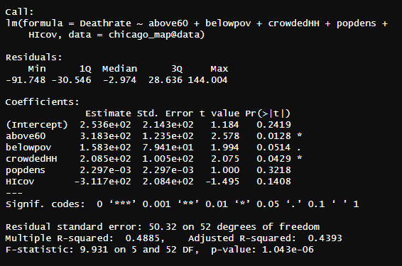
reg2<-lm(Deathrate~above60+belowpov+crowdedHH+popdens+HIcov, data=chicago_map@data)
summary(reg2)
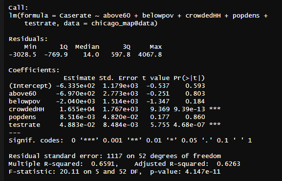
The two regressions show some surprising results. Starting with the case rate regression, there were only two statistically significant variables that had p-values below the 0.05 threshold: crowded house holds with 4+ people and test rate. Of course it makes sense that test rates would increase the case rate as the more tests that are conducted cause there to be more positive COVID cases. However, omitting this variable still does not change the results of the regression. It appears that based on this sample of data, the most significant variable that affects the case rate is those with more than 4 people in the house, which in and of itself is not surprising as the more people that come and go and live within the same space the greater chance there is for the spread of the virus.
The regression on death rates is similar, however being above 60 does appears to also have a significant effect on whether or not someone dies from COVID-19 in addition to crowded HH. This is not surprising as people who are older are hit harder by the virus given their weakened immune system and ability to combat infection. It is also interesting to consider that while significant, being below the poverty line was quite close, a p-value of 0.0514, to being significant at the alpha of 0.05, so with more data, another regression could show that being below the poverty line has a statistically significant relationship with death rates.
However, the R-squared values should be noted here. For the first case rates regression, an R-squared of 0.6263 indicates that the model was moderately successful in accounting for the factours that impact case rates. The R-squared for death rates is lower, roughly 0.4885, meaning that there are other variables not accounted for in the regression that are influencing the death rate. This could possibly explain the discrepancies in the death rate with only crowdedHH being statistically significant. Perhaps other variables such as distance to nearest hospitals could be used in future analysis to further account for things that influence whether or not an individual dies from COVID. Given the impact of underlying conditions in COVID survival rates, this would also have been useful to look at as it could account for the missing variables in the model ran above, though given medical confidentiality, impossible to do in practice.
Final Remarks
Following analysis of both the LISA maps and the linear regression, I found it quite interesting that of the socioeconomic variables that were chosen for analysis, only the amount of people in the household had a statistically significant impact on the case and death rates, with of course the test-rate making a different in the case rates. It was previously believed that poverty rates or health insurance coverage would have a significant impact on the amount of deaths or cases as groups that are either under the poverty line or don’t have heath insurance would be expected to not have access to treatment or work service level jobs that expose them more to the virus. Based on the linear regression models, this was not the case, though given the relatively low R squared values, especially in the case of the death rates linear regression, there are certainly other variables at play here that are represented in the models. However, it was not surprising to observe that death rates were significantly impacted by share of people over 60 as it has been quite known since the pandemic began that the elderly are more susceptable to COVID than the young. Future analysis with more available data such as distance to health care services or perhaps median income as well as a larger sample size could be helpful to construct more accurate models. Similarly, breaking the tract level down to neighborhoods may help to better highlight the differences on a smaller, more specific tract level. One result that wasn’t surprising was the LISA maps showing hot spots for case rates on the West side and cold spots for death rates in downtown.
The west and south side of Chicago have always been behind in terms of investment, median income, access to jobs/healthcare/education, and high in crime. The pandemic seems to have hit these areas the hardest given the relatively weak economic base these areas had before the health crisis. And since not a lot of people live in downtown relative to the rest of the city, it makes sense death rates are lower there. Overall, there were no surprises with the LISA map but the results of the regressions were interesting and not what was initially predicted. The results of this analysis could be used for city officials in determining where to direct resources to in future health crises or to highlight areas that are disinvested in terms of healthcare access or economic opportunity as it appears these two are concentrated on the west sides.